A few years ago I left my comfortable career of managing the live production environment for churches to study in the new-at-the-time iOS development program at Lambda School (now called Bloom Institute of Technology). I spent basically all day every day for nine months reading and writing Swift and learning how to build iOS apps. Since I finished that program I have worked on a few apps, learned as much as I can, and most recently landed at a company called Hallow. I continue to learn as I go, and I try to document the progress when I can. If you're interested in following along with that, checkout dilloncodes.com.
In this series of posts I am going to be building out the UI for Airbnb's "Explore" tab from scratch. This is an exercise in figuring out how to achieve the different layouts and effects you find in popular apps and I chose Airbnb because I thought it had several great examples. It is not intended to be used for anything other than for educational purposes and all my code will be available at this repo if you want to follow along and build it yourself. A few disclaimers:
- For all the illustrations in the app I just took screenshots of the actual app and cropped them to size. They are not the full versions of the illustrations and they are not really even formatted correctly for use in an iOS app. I tried to spend as little time as possible on that prep.
- We will get the fonts, colors and icons as close as we can with just using the system versions. I am pretty sure the font and icons that Airbnb actually uses would require a license and I don't care that much about making this exact. With the way we organize it, it would be pretty easy to swap in the real ones if you want to take that step yourself.
- We will not do any business logic. We will hard code all the data and not handle any user actions. Again, this is not meant to be production code, just an exploration of some UI techniques.
- There is a good chance that Airbnb will look different by the time you see this. Honestly, there's a non-zero chance that it will change before I finish writing this, so the live app will probably look different than what you see me build, but the layout/principles should be pretty much the same. (Editorial note: it has already changed before I was able to finish writing this series, but I have a few screenshots of what the app looked like before, and we'll just build up to the spec that I created.)
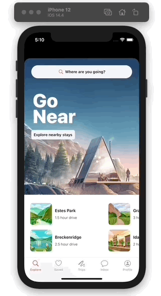
Here's what our final product will look like:
With all that said, let's go.
The Footer
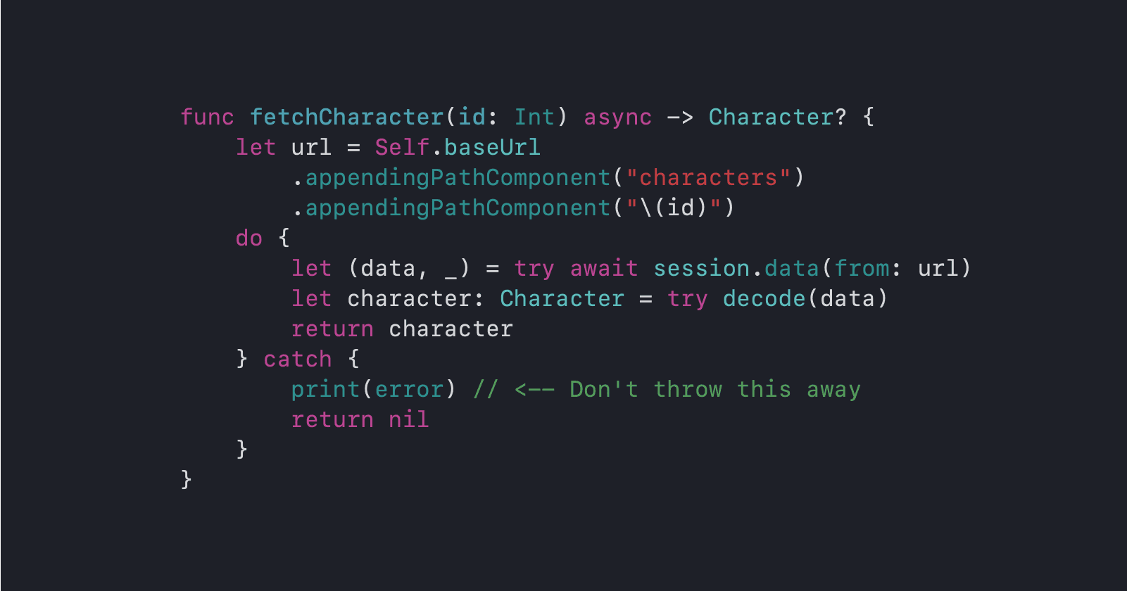
The last section we need to implement for the collection view is the footer. This section will be pretty similar to the first one, only with four items per group instead of two. Lets add a cell for that section:
// In Colleciton View Elements/FooterCell.swift

typealias FooterCell = ContentCell<FooterView>

final class FooterView: ProgrammaticView, ContentConfiguringView {
    private let stack = UIStackView()
    private let titleLabel = UILabel()
    private let subtitleLabel = UILabel()

    override func configure() {
        stack.axis = .vertical
        stack.spacing = 4

        titleLabel.font = .custom(style: .headline)
        subtitleLabel.font = .custom(style: .subheadline)
    }

    override func constrain() {
        addSubviews(stack)
        stack.addArrangedSubviews(titleLabel, subtitleLabel)

        stack.horizontalAnchors == horizontalAnchors
        stack.verticalAnchors == verticalAnchors + 28
    }

    func configure(with content: Content?) {
        titleLabel.text = content?.title
        subtitleLabel.text = content?.subtitle

        switch content?.style {
        case .standard: titleLabel.font = .custom(style: .headline)
        case .title: titleLabel.font = .custom(style: .title4)
        case .none: break
        }
    }
}
The Footer Section
We'll need a background for that section, since it is a different color. Fortunately, the infrastructure we set up in the last part will make this very easy:
// In Collection View Elements/BackgroundView.swift

// add view
final class SecondaryBackgroundView: BackgroundView {
    override func provideBackgroundColor() -> UIColor? {
        .secondarySystemBackground
    }
}

// add BackgroundStyle case
enum BackgroundStyle: String, CaseIterable {
    case inverted, secondary

    var elementKind: String { "background.\(rawValue)" }

    var viewClass: AnyClass {
        switch self {
        case .inverted: return InvertedBackgroundView.self
        case .secondary: return SecondaryBackgroundView.self
        }
    }
}
Then we just need to add a layout section for it:
// In Collection View Elements/NSCollectionLayoutSection+Layouts.swift

static func footer() -> NSCollectionLayoutSection {
    let itemSize = NSCollectionLayoutSize(widthDimension: .fractionalWidth(1),
                                          heightDimension: .estimated(60))
    let item = NSCollectionLayoutItem(layoutSize: itemSize)

    let groupSize = NSCollectionLayoutSize(widthDimension: .fractionalWidth(0.7),
                                           heightDimension: .estimated(200))
    let group = NSCollectionLayoutGroup.vertical(layoutSize: groupSize,
                                                 subitems: [item, item, item, item])

    let headerSize = NSCollectionLayoutSize(widthDimension: .fractionalWidth(1),
                                            heightDimension: .estimated(100))
    let header = NSCollectionLayoutBoundarySupplementaryItem.header(layoutSize: headerSize)

    let section = NSCollectionLayoutSection(group: group)
    section.orthogonalScrollingBehavior = .groupPaging
    section.boundarySupplementaryItems = [header]
    section.interGroupSpacing = 12
    section.contentInsets = .init(top: 0, leading: 20, bottom: 20, trailing: 20)

    section.addBackground(style: .secondary)

    return section
}
Showing The Footer
To actually see it, we'll need to uncomment the footer section and the rest of the stubbed data:
// In Models/Content.swift

enum Section: Int, Hashable, CaseIterable {
    case nearby, stays, experiences, hosting, info
}

// in headerContent() switch statment
case .info: return .init(title: "Stay informed", subtitle: nil, image: nil)

// in stubData() switch statment
case .info:
    return [
        .init(title: "For guests", subtitle: nil, image: nil, style: .title),
        .init(title: "Our COVID-19 response",
              subtitle: "Health and saftey updates",
              image: nil),
        .init(title: "Cancellation options",
              subtitle: "Learn what's covered",
              image: nil),
        .init(title: "Help Center",
              subtitle: "Get support",
              image: nil),

        .init(title: "For hosts", subtitle: nil, image: nil, style: .title),
        .init(title: "Message from Brian Chesky",
              subtitle: "Hear from our CEO",
              image: nil),
        .init(title: "Resources for hosting",
              subtitle: "What's impacted by COVID-19",
              image: nil),
        .init(title: "Providing frontline stays",
              subtitle: "Learn how to help",
              image: nil),

        .init(title: "For COVID-19 responders", subtitle: nil, image: nil, style: .title),
        .init(title: "Frontline stays",
              subtitle: "Learn about our program",
              image: nil),
        .init(title: "Sign up",
              subtitle: "Check for housing options",
              image: nil),
        .init(title: "Make a donation",
              subtitle: "Support nonprofit organizations",
              image: nil),

        .init(title: "More", subtitle: nil, image: nil, style: .title),
        .init(title: "Airbnb Newsroom",
              subtitle: "Latest announcements",
              image: nil),
        .init(title: "World Health Organization",
              subtitle: "Education and updates",
              image: nil),
        .init(title: "Project Lighthouse",
              subtitle: "Finding and fighting discrimination",
              image: nil),
    ]
And we'll need to update the collection view and data source to show the content in the right section:
// In HomeView.swift

// in makeCollectionView() switch statement
case .info:
    return .footer()

// in makeDataSource() switch statement
case .info:
    let registration = FooterCell.registration()
    return view.dequeueConfiguredReusableCell(using: registration,
                                              for: indexPath,
                                              item: item)
And with that, the footer section is visible and looks pretty good. The only thing we're missing is the separators.

Adding Separators
I went back and forth on the best way to implement this and where I landed was to break it up into a couple of parts so things can stay decoupled. We'll define another protocol to provide a method to show a separator or not, we'll let individual cells decide if they want to have a separator at all, and we'll pass a closure as an argument to registration to allow the data source to define if a specific cell should show its separator or not.
First, let's add a view to the FooterCell that will be our separator:
// In Colleciton View Elements/FooterCell.swift

private let separator = UIView()

// in configure()
separator.backgroundColor = .quaternaryLabel

// in constrain()
addSubviews(stack, separator)
// other stuff...
separator.topAnchor == bottomAnchor
separator.horizontalAnchors == stack.horizontalAnchors
separator.heightAnchor == 1
Then we'll add a protocol with the showSeparator method and have our content cell forward it on to the view, if the view has adopted the protocol:
// In Colleciton View Elements/ContentCell.swift

protocol SeparatorShowing: AnyObject {
    func showSeparator(_ shouldShow: Bool)
}

extension ContentCell: SeparatorShowing where View: SeparatorShowing {
    func showSeparator(_ shouldShow: Bool) {
        view.showSeparator(shouldShow)
    }
}
Then we need our FooterView to conform to this protocol:
// In Colleciton View Elements/FooterCell.swift

extension FooterView: SeparatorShowing {
    func showSeparator(_ shouldShow: Bool) {
        separator.alpha = shouldShow ? 0.8 : 0
    }
}
Then we need a way to decide if we should show the separator or not. In this case, we'll want to show it for the items at indexes 0, 1, 2 and hide it for 3, then show it for 4, 5, 6 and hide it for 7, etc. We have access to that index in the registration, but really the data source should be the one making the decision so we'll pass the index back to the data source in a closure and get a boolean back:
static func registration(showSeparator: @escaping (IndexPath) -> Bool = { _ in false }) -> UICollectionView.CellRegistration<ContentCell<View>, Content> {
    UICollectionView.CellRegistration { cell, indexPath, content in
        cell.configure(with: content)
        if let cell = cell as? SeparatorShowing {
            let shouldShow = showSeparator(indexPath)
            cell.showSeparator(shouldShow)
        }
    }
}
Giving the closure a default value will mean that we only need to provide this if we care about it, which is good because we only care about it in this one section. And casting the cell as SeparatorShowing before calling that closure ensures that it only gets called if the cell can actually do something with the information.
Now we just need to update makeDataSource to provide the closue in the .info section:
// In HomeView.swift

case .info:
    let registration = FooterCell.registration() { indexPath in
        indexPath.item % 4 != 3
    }
If you're not familiar with modulo math this check will divide the item index by 4 and look at the remainder. If it is 3, we'll return false (to hide the separator) and otherwise we'll return true (to show the separator). If you try that out with the sequence of numbers outlined above, you'll find that this leads to the exact sequence we wanted. Or you can just run the app and see it for yourself.
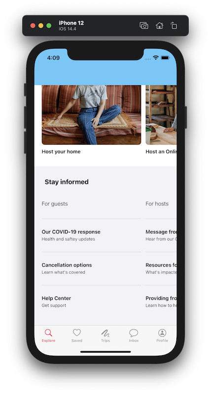
Wrap Up
In this post we added a footer cell, we added a footer section with a background color, and we looked at one method for adding separators to cells. In the last part, we'll totally shift gears and get the collapsing header set up!
Check out the code up to this point in this repo.