


In this series of posts I am going to be building out the UI for Airbnb's "Explore" tab from scratch. This is an exercise in figuring out how to achieve the different layouts and effects you find in popular apps and I chose Airbnb because I thought it had several great examples. It is not intended to be used for anything other than for educational purposes and all my code will be available at this repo if you want to follow along and build it yourself. A few disclaimers:
- For all the illustrations in the app I just took screenshots of the actual app and cropped them to size. They are not the full versions of the illustrations and they are not really even formatted correctly for use in an iOS app. I tried to spend as little time as possible on that prep.
- We will get the fonts, colors and icons as close as we can with just using the system versions. I am pretty sure the font and icons that Airbnb actually uses would require a license and I don't care that much about making this exact. With the way we organize it, it would be pretty easy to swap in the real ones if you want to take that step yourself.
- We will not do any business logic. We will hard code all the data and not handle any user actions. Again, this is not meant to be production code, just an exploration of some UI techniques.
- There is a good chance that Airbnb will look different by the time you see this. Honestly, there's a non-zero chance that it will change before I finish writing this, so the live app will probably look different than what you see me build, but the layout/principles should be pretty much the same. (Editorial note: it has already changed before I was able to finish writing this series, but I have a few screenshots of what the app looked like before, and we'll just build up to the spec that I created.)
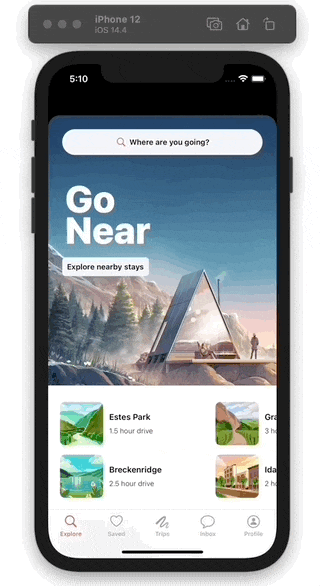
Here's what our final product will look like:
With all that said, let's go.
First Cell and Section
The first thing we need to do is lay out the home view. It will be separated into basically two parts, the header and the collection view, so let's add those:
// In HomeView.swift
// add views, just using an empty collection view for now
private let headerView = HeaderView()
private let collectionView = UICollectionView(frame: .zero,
collectionViewLayout: .init())
override func configure() {
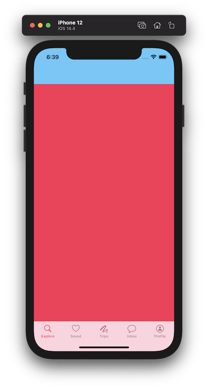
// change the collection view's background color so we know where it is
collectionView.backgroundColor = .systemPink
}
override func constrain() {
// use the helper to add the subviews
addSubviews(headerView, collectionView)
// header should be tied to the top,
// leading and trailing edges of the view
// and the bottom to the top of the collection view
headerView.topAnchor == topAnchor
headerView.horizontalAnchors == horizontalAnchors
headerView.bottomAnchor == collectionView.topAnchor
// collection view is constrained to take
// the rest of the available space
collectionView.horizontalAnchors == horizontalAnchors
collectionView.bottomAnchor == bottomAnchor
}
If you run the app right now, you'll find that the whole screen is teal, which is the header's color. This is because we aren't constraining it's height anywhere, so it taking up the whole view is a valid layout according to the constraints we have. For this project, we're going to have the header manage it's own height so we can encapsulate all the animation stuff into that one view. For now, let's just give it a static height.
// In HeaderView.swift

override func constrain() {
    heightAnchor == 100
}
Now if we run it, it looks roughly the same proportions as Airbnb when the header is in the fully-collapsed state and that's what we want for now.
Add The SmallSquareView
To make things easier for ourselves, we're going to define our cells' views as ProgrammaticViews and just use the UICollectionViewCell as a wrapper around that. So add a file called SmallSquareCell.swift and let's write the view:
// In Collection View Elements/SmallSquareCell.swift

import Anchorage
import UIKit

final class SmallSquareView: ProgrammaticView {

    private let imageView = UIImageView()
    private let stack = UIStackView()
    private let titleLabel = UILabel()
    private let subtitleLabel = UILabel()

    override func configure() {
        imageView.backgroundColor = .secondarySystemFill
        imageView.layer.cornerRadius = 8
        imageView.layer.masksToBounds = true

        stack.axis = .vertical
        stack.spacing = 8
    }

    override func constrain() {
        addSubviews(imageView, stack)
        stack.addArrangedSubviews(titleLabel, subtitleLabel)

        imageView.verticalAnchors == verticalAnchors
        imageView.leadingAnchor == leadingAnchor
        imageView.widthAnchor == imageView.heightAnchor

        stack.leadingAnchor == imageView.trailingAnchor + 10
        stack.trailingAnchor == trailingAnchor
        stack.centerYAnchor == centerYAnchor
    }
}
That gets us most of the way there, but we need two more things. We need to set the fonts of the labels, and we need a way to get the content into this view. For the fonts, I like to define semantically named static constants on UIFont, whose names roughly match the ones that Apple provides, but whose style matches my app. I also like to define a function called custom(style:) that returns one of those styles to make it clear in code that this is our app's font, not a system font. That looks like this:
// In Extensions/UIFont+Custom.swift

extension UIFont {
    private static var headline: UIFont {
        UIFontMetrics(forTextStyle: .headline)
            .scaledFont(for: .systemFont(ofSize: 14, weight: .semibold))
    }

    private static var subheadline: UIFont {
        UIFontMetrics(forTextStyle: .subheadline)
            .scaledFont(for: .systemFont(ofSize: 12, weight: .light))
    }
}

extension UIFont {
    enum Style {
        case headline
        case subheadline
    }

    static func custom(style: Style) -> UIFont {
        switch style {
        case .headline: return headline
        case .subheadline: return subheadline
        }
    }
}
This gives us a central place to define the fonts for our app, it builds in support for dynamically-sized fonts and it gives us a clear and consistent api to use at the call site:
// In SmallSquareView.configure

titleLabel.font = .custom(style: .headline)
subtitleLabel.font = .custom(style: .subheadline)
We also need a way to give this view some Content that it will then display. We're going to do that with this function:
// In Collection View Elements/SmallSquareCell.swift

func configure(with content: Content?) {
    titleLabel.text = content?.title
    subtitleLabel.text = content?.subtitle
    imageView.image = UIImage(named: content?.image) // using our UIImage initializer
}
Our First Cell
Now we need to use that view in a collection view cell, so it can actually be displayed. I try to keep this as simple as possible, just a straight wrapper that passes things through to the view.
final class SmallSquareCell: UICollectionViewCell {

    private lazy var view: SmallSquareView = .init()

    override init(frame: CGRect) {
        super.init(frame: frame)
        constrain()
    }

    required init?(coder: NSCoder) {
        super.init(coder: coder)
        constrain()
    }

    private func constrain() {
        contentView.addSubview(view)
        view.edgeAnchors == contentView.edgeAnchors
    }

    func configure(with content: Content?) {
        view.configure(with: content)
    }
}
Now that we have a full-fledged cell that we can use, but we need a layout and a data source for the collection view.
Our First Section
We're going to use the relatively new UICollectionViewCompositionalLayout for our collection view, which will be composed of several sections. To make things easier to read and reason about, I am going to split up the section definitions into their own functions, which also conveniently makes them resuable. This first one needs to be a side-scrolling section with groups of two items stacked on top of each other, so I'm going to call it sideScrollingTwoItem().
// In Collection View Elements/NSCollectionLayoutSection+Layouts.swift

static func sideScrollingTwoItem() -> NSCollectionLayoutSection {
    // Define the individual items:
    // We want the items to be the same width as their group and
    // to take as much height as they need, which could change
    // because we support dynamically sized fonts
    let itemSize = NSCollectionLayoutSize(widthDimension: .fractionalWidth(1),
                                          heightDimension: .estimated(85))
    let item = NSCollectionLayoutItem(layoutSize: itemSize)
    item.contentInsets = .init(top: 8, leading: 0, bottom: 8, trailing: 0)

    // Define the groups:
    // We want the next group to be poking in from the edge
    // of the screen, so we'll make the groups a little bit
    // less than the full width of the section.
    // We also want 2 items per group.
    let groupSize = NSCollectionLayoutSize(widthDimension: .fractionalWidth(0.65),
                                           heightDimension: .estimated(180))
    let group = NSCollectionLayoutGroup.vertical(layoutSize: groupSize,
                                                 subitem: item,
                                                 count: 2)
    // Define the section:
    // We want each group to snap into place as you scroll so
    // we'll use the group paging orthogonal scrolling behavior.
    let section = NSCollectionLayoutSection(group: group)
    section.orthogonalScrollingBehavior = .groupPaging
    section.interGroupSpacing = 12
    section.contentInsets = .init(top: 20, leading: 20, bottom: 20, trailing: 20)
    return section
}
The Section Model
Now we need some content to show in this section so we are going to add a new type called Section that will define the content for the different sections on our screen. I'll add them all now, but comment out all but the first.
// In Models/Content.swift

enum Section: Int, Hashable, CaseIterable {
    case nearby //, stays, experiences, hosting, info
}
While we're here, we can also uncomment the stub data for the first section:
// In Models/Content.swift

extension Section {
    func stubData() -> [Content] {
        switch self {
        case .nearby:
            return [
                .init(title: "Estes Park", subtitle: "1.5 hour drive", image: "estes-park"),
                .init(title: "Breckenridge", subtitle: "2.5 hour drive", image: "breckenridge"),
                .init(title: "Grand Lake", subtitle: "3 hour drive", image: "grand-lake"),
                .init(title: "Idaho Springs", subtitle: "2 hour drive", image: "idaho-springs"),
                .init(title: "Glenwood Springs", subtitle: "4.5 hour drive", image: "glenwood-springs"),
                .init(title: "Pagosa Springs", subtitle: "7.5 hour drive", image: "pagosa-springs"),
            ]
        // other cases commented out...
        }
    }
}
Making The Collection View
Now that we have a section layout defined, and a data model in place, we can build our collection view. It is really pretty simple, UICollectionViewCompsitionalLayout has an initializer that takes a closure where we are given a section index and a layout environment and we need to return a NSCollectionLayoutSection. Since we defined our layout as a static function on NSCollectionLayoutSection, we can just pick the layout using dot syntax. It looks like this:
// In an extension on HomeView

func makeCollectionView() -> UICollectionView {
    let layout = UICollectionViewCompositionalLayout { sectionIndex, layoutEnvironment in
        let section = Section.allCases[sectionIndex]
        switch section {
        case .nearby:
            return .sideScrollingTwoItem()
        }
    }
    return UICollectionView(frame: .zero, collectionViewLayout: layout)
}
We don't really need the switch statment right now, since there is only one case. But it will set us up well for adding the rest of the sections in subsequent articles. Now we just need to use this function to initialize our collection view:
// In HomeView

private lazy var collectionView = makeCollectionView()
Making The Data Source
Finally, we'll need a data source to provide the content for the collection view. We're going to write another function that will create a UICollectionViewDiffableDataSource, and this is going to take the nested closures thing to a whole other level. The data source is initialized with a collection view and a closure that is given a collection view and an index path and needs to return a configured cell. To configure the cell we're going to use a UICollectionView.CellRegistration, and its initializer also takes a closure which is given a cell, an index path and some content. It can take some time to wrap your head around how all this is working, especially if you're used to the old UICollectionViewDataSource methods. It definitely took me some trial and error. Here's what it will look like:
// In an extension on HomeView

func makeDataSource() -> UICollectionViewDiffableDataSource<Section, Content> {
    let registration = UICollectionView.CellRegistration<SmallSquareCell, Content> {
    cell, indexPath, content in
        cell.configure(with: content)
    }
    let dataSource = UICollectionViewDiffableDataSource<Section, Content>(
        collectionView: collectionView) { view, indexPath, item in
        let section = Section.allCases[indexPath.section]
        switch section {
        case .nearby:
            return view.dequeueConfiguredReusableCell(using: registration,
                                                      for: indexPath,
                                                      item: item)
        }
    }
    return dataSource
}
One thing I like to do is define those registrations on the cell class itself, because that gives a convenient place to put it and it is nice and readable at the call site. So let's add this static function on SmallSquareCell:
// In SmallSquareCell.swift

static func registration() -> UICollectionView.CellRegistration<SmallSquareCell, Content> {
    UICollectionView.CellRegistration { cell, indexPath, content in
        cell.configure(with: content)
    }
}
Then, we can just do this in the .nearby section in makeDataSource:
let registration = SmallSquareCell.registration()
return view.dequeueConfiguredReusableCell(using: registration,
                                          for: indexPath,
                                          item: item)
Now we need to use makeDataSource() and set our collection view's data source:
// In HomeView

private lazy var dataSouce = makeDataSource()

override func configure() {
    collectionView.backgroundColor = .systemBackground
    collectionView.dataSource = dataSouce
}
Hooking Up The Data Source
Finally, we just need to give the actual data to the data source. For that, we're going to do two things. We'll expose a function on HomeView that will allow someone up the chain to apply an NSDiffableDataSourceSnapshot to this view. We're doing this because the view shouldn't really manage any data itself, it should just be handed content to display. Then, we'll add a function to HomeViewController that will generate the stubbed data and give it to the view. In a real app the data would be fetched by a networking or data base layer and handed to the view controller, but this will work well enough for our purposes.
// In HomeView

func apply(_ snapshot: NSDiffableDataSourceSnapshot<Section, Content>) {
    dataSouce.apply(snapshot)
}

// In HomeViewController

override func viewDidLoad() {
    super.viewDidLoad()
    updateList()
}

private func updateList() {
    var snapShot = NSDiffableDataSourceSnapshot<Section, Content>()
    snapShot.appendSections(Section.allCases)
    Section.allCases.forEach {
        snapShot.appendItems($0.stubData(), toSection: $0)
    }
    contentView.apply(snapShot)
}
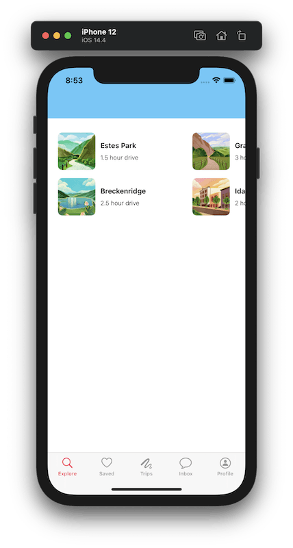
And with that, we should be finally be able to see the first section on screen, fully populated with all the stubbed data!
Wrap Up
In this article we set up the view for our first cell and wrote a wrapper around it, we defined the layout for our first section, we built out the structure for our collection view and data source, and hooked it all up. In the next article we'll fill out the collection view with the rest of the content.
Check out the code up to this point on this branch in the repo.